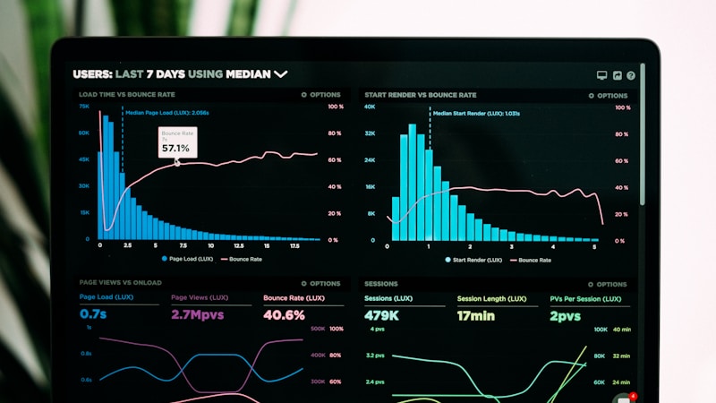
Getting Started with TanStack Router
Learn how to build modern React applications with type-safe routing and nested layouts.
Shared components built with the ChromaDB design system
Extra Large Text - Inter
Large Text - Inter
Base Text - Inter (Default)
Small Text - Inter
Extra Small Text - Inter
Default text color
Muted text color (#737373)
Emerald Green (#00855d)
Coral Orange (#ff6b35)
Lavender Purple (#cba6f7)
Sky Blue (#4a81de)
Inline Code:
Use the console.log() function to debug your code.
Code Block:
import { createFileRoute } from '@tanstack/react-router'

export const Route = createFileRoute('/about')({
  component: AboutComponent,
})Click to see the radial clip-path animation expand from the button
Toggle Theme
Default
Ghost
Outline
Small
Default
Large
A minimal pulsing dot with a liquid glass glow effect. Useful for indicating active status or drawing subtle attention.
Combines the glowing dot with a rotating text animation. Topics cycle through with a vertical scroll effect.
Standard card with subtle border
This is a default card with a subtle border (#e5e5e5). Perfect for content sections.
Mac-style card with shadow effect
This card features the signature Mac-style offset shadow and black border for emphasis.
A complete example with header, content, and footer
This card demonstrates all available card components working together with the ChromaDB design system.
<Card variant="emphasis">
  <CardHeader>
    <CardTitle>Title</CardTitle>
    <CardDescription>Description</CardDescription>
  </CardHeader>
  <CardContent>Content here</CardContent>
  <CardFooter>Footer content</CardFooter>
</Card>Emerald
Mac-style card with emerald green accent on hover.
Coral
Mac-style card with coral orange accent on hover.
Lavender
Mac-style card with lavender purple accent on hover.
Blog cards display a featured image, title, and description. They follow the neobrutalist design with Mac-style shadows and optional accent colors on hover.
Learn how to build modern React applications with type-safe routing and nested layouts.
Project cards display a media preview (image or video), title, description, tags, and action links. Ideal for showcasing portfolio projects with links to repositories, demos, and articles.
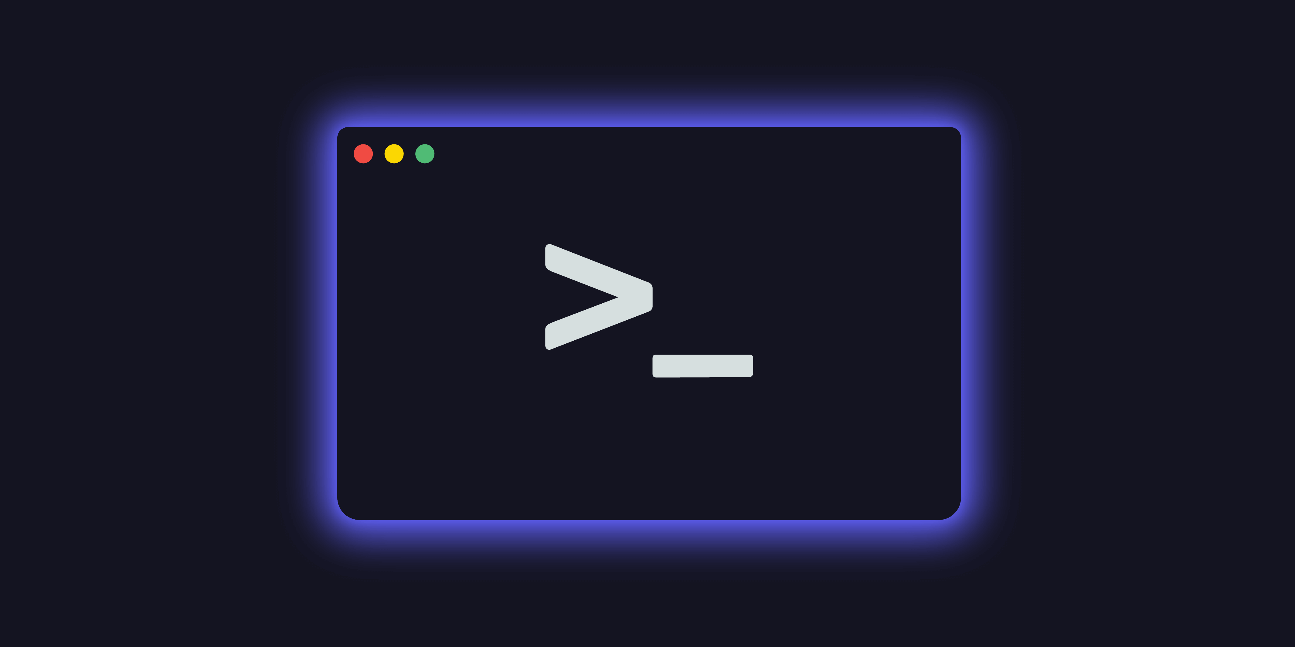
A fast, keyboard-driven task manager built with Rust and SQLite for local-first productivity.
Add tags to highlight tech stack, achievements, or project status. Tags support accent colors: emerald, coral, lavender, sky.
Use mediaType="video" for auto-playing, looped video previews. Videos play muted and loop continuously like a GIF but with better compression.
Browser-based motion graphics tool with timeline editing and real-time preview.
Post lists display blog entries in a compact format with tap-to-expand on mobile and hover-to-reveal on desktop. The description expands smoothly using CSS grid transitions.
Project lists showcase work with accent-colored underlines, type indicators, and badges. Features 40x40 thumbnails on mobile with tap-to-expand, and hover-to-reveal on desktop with full image and description.
Default
Glass (backdrop-blur)
Hover over links to see colored highlights with subtle shadow
Spring-animated hamburger with 2 lines that morphs into an X. Click to toggle.
State: Closed (=)
Container sizes control max-width and responsive padding:
<Container size="sm">Small (640px)</Container>
<Container size="md">Medium (768px)</Container>
<Container size="lg">Large (1024px)</Container>
<Container size="xl">Extra Large (1280px)</Container>
<Container size="2xl">2XL (1536px)</Container>
<Container size="full">Full Width</Container>
Current page container:
<Container size="xl" padding="default">Primary Palette
--background: #fafafa--card-background: #fff--foreground: #0a0a0a--muted: #737373Accent Colors
--color-emerald: #00855d--color-coral: #ff6b35--color-lavender: #cba6f7--color-sky: #4a81deFont Families
Playfair Display
Headings & Display
Inter
Body Text
IBM Plex Mono
Code & Technical
Spacing
--spacing: 0.25rem (4px base)Border Radius
--radius-sm: 2px (cards)--radius-md: 6px (buttons)--radius-lg: 8px (images)Component library built with TanStack Start, Tailwind CSS, and CVA
Following the ChromaDB design system principles
Back to Home